

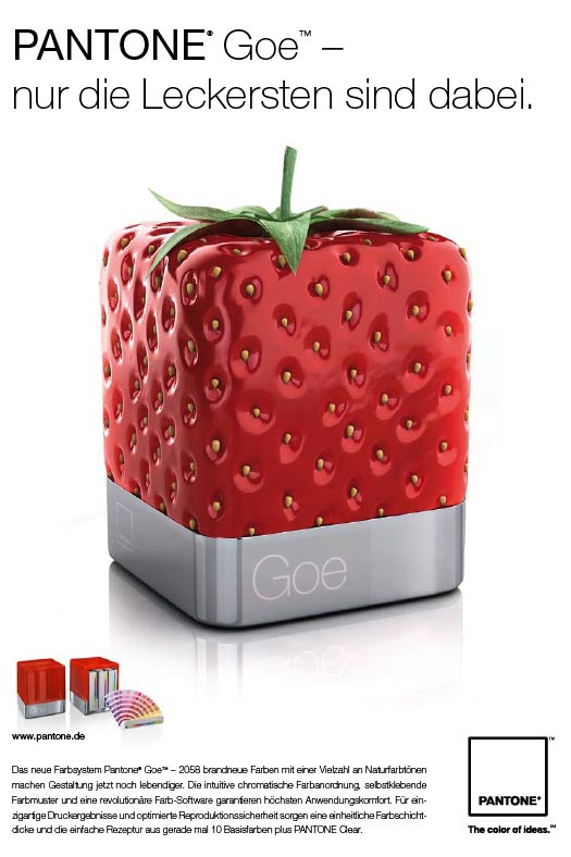
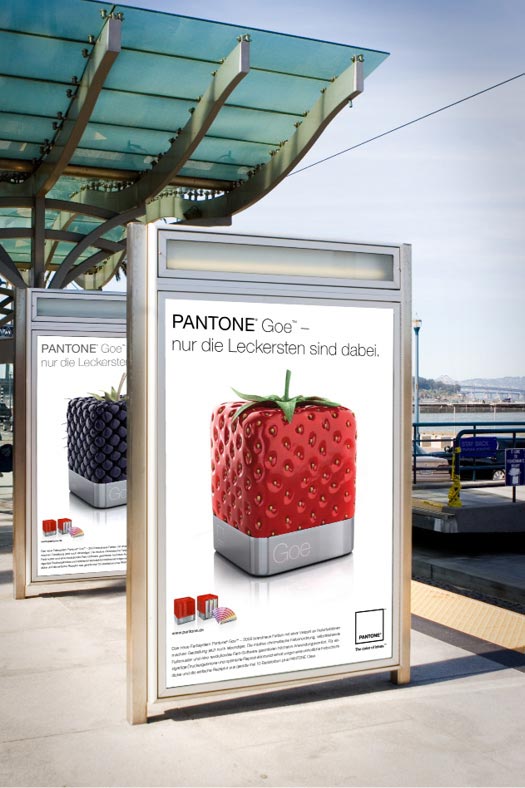
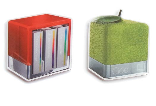
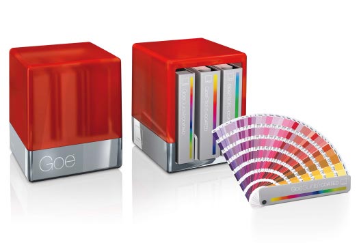
PantoneAd campaignA print campaign with an image concept and slogan, including relevant promotional tools for the launch, was developed for the reissue of the PANTONE GOE colour system.
|
 |
 |
 |
|
|
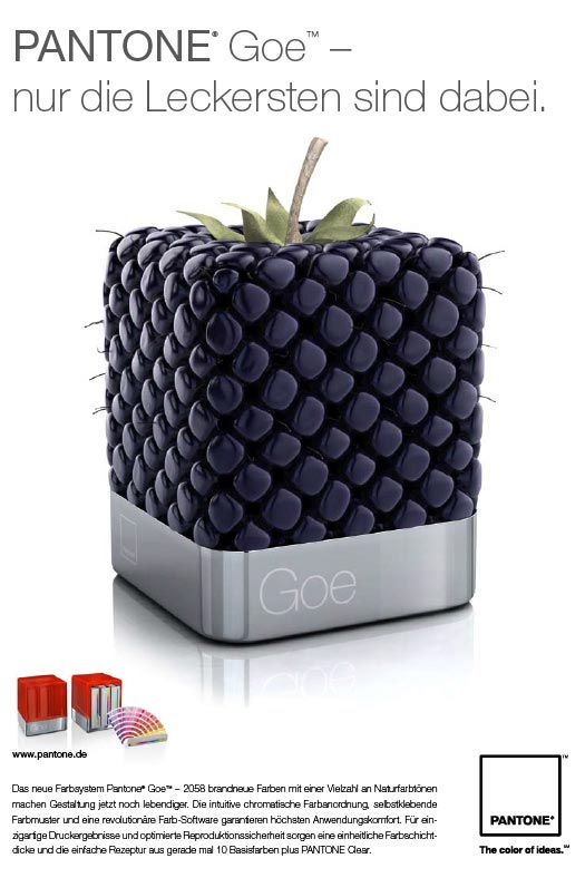
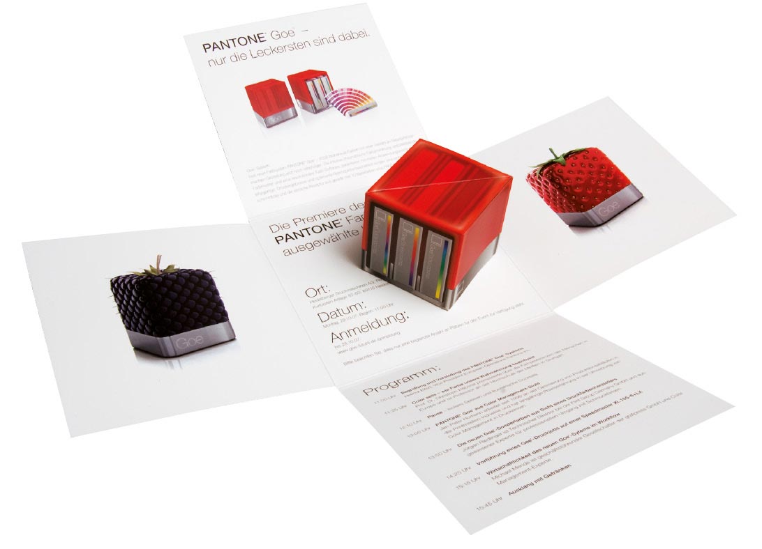
PantoneAd campaignA print campaign with an image concept and slogan, including relevant promotional tools for the launch, was developed for the reissue of the PANTONE GOE colour system.
|
|
|
|
|
|